
Our website, http://www.thepuppyranch.com/, comprises of many complex levels.
This becomes evident when looking at our map of the information architecture:
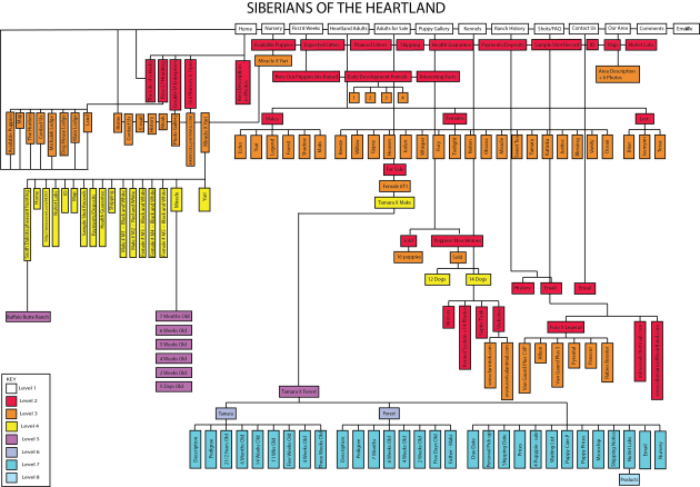
The website relies heavily on audience persistence and intuitive to find their way around. This makes it very easy to get lost within the website and its mass amount of information. This factor has motivated us to define the pro’s and cons of the website as well as the necessary changes needed to take place in order to improve it:
Pros:
- the design of the website allows for easy navigation.
- all of the information is arranged within the scan column on the left hand side of the page.
- mobile friendly.
- content area has separate scroll to the scan column; allows for header to be available at all times.
- some pictures of the dogs act as hyperlinks to information about them.
- the glittery aesthetics of the website have a certain endearing quality to them; it creates a sense of individuality, therefore we may aim to preserve this aspect in some way.
Cons:
- some pages lack titles.
- large chunks of information are scattered throughout the website, making it tiresome to read and impacting on how well the site can communicate to readers where they may lose interest.
- no breadcrumb or global/local navigation; audiences can become easily lost in the site amongst all the content.
- lacks ‘jump to top’ links; these would be ideal considering the amount of content.
- website has overwhelming amount of hyperlinks scattered throughout which jump to other avenues of the site = messy, confusing and no hierarchy.
- overall structure and organisation of the content is messy.
- busy and changing backgrounds making information hard to read.
- font is not easy to read, is not visually appealing or consistent.
- lacking a design system; specific colours, font etc.
- photo edits of dogs = unnecessary and deducts professional feel of the website and business.
- logo and identity of the website is not a hyperlink to the homepage.
- website is dominated by an overwhelming amount of links that form a complex system where hierarchy is not applied.
- distractive visual effects of website – photos, images, icons etc.
Changes:
- a footer would be useful in order to showcase important information that is relevant to purchasing a product e.g. the details of the breeders.
- breadcrumb navigation: to avoid users becoming lost in the site.
- global/local navigation to compile the information in a neat and compact manner.
- shopping cart: for users to view their current choices of dogs for adoption.
- search engine: would also avoid cluttering of information on website and make it easier for audiences who are aware of the sites content, to quickly find what they are looking for.
- accessing information in a straightforward manner and ensure the clarity of listed products.
- cut down on the amount of content e.g. images, information etc.
- include social media to expand potential customers.
